Why I Built Depo
Once you become honest with your finances, you stop guessing and start knowing. Depo exists for that moment.
Hey, I'm Sergey. I built Depo, and I want to tell you why.
When I started my professional career, my financial life was not impressive.
I was not making much money, and because of that, I had a flawed idea about budgeting. My thinking was simple: if there is not much money, what is there to budget?
Looking back, that was completely wrong.
Budgeting is not about how much you make. It is about knowing what you actually have, and what is already spoken for.
That realization took years to arrive. When it did, it changed how I thought about money entirely.
Bank balance is not your daily budget
What you see vs. what's actually yours.
I remember opening my bank account one evening and realizing that I had been treating my entire bank balance as spending money.
It was not.
Some of it already belonged to rent, bills, and the things I said I wanted to save for. Some of it needed to be a buffer so that every surprise did not turn into panic.
Seeing that split on one screen was uncomfortable, but also weirdly calming. Nothing had changed in my account that day. I just finally understood what the number meant.
It also made me realize that I needed a buffer. I could not make my finances work properly if every dollar in my account felt available to spend. If I kept pretending the full balance was “mine,” I would keep avoiding the truth.
The shift
I spent a little less, cancelled subscriptions I did not need, and found some essential costs I could reduce. Then I started saving. Later, I started investing. The changes came from seeing the real picture, not from becoming a different person.
The system I found on Reddit
Then I found a budgeting spreadsheet on Reddit, which helped me a lot. It was a simple system.
Your income comes in. You account for essentials. You put money aside for savings. Then it gives you a clear amount: how much you can safely spend that day.
Say you have money left after rent, bills, and savings, and ten days remain in the month. The system turns what remains into a number for today. Spend less, and more carries into tomorrow. Spend more, and tomorrow adjusts.
It is not a limit designed to punish you. It is simply the clearest picture of what is safe right now — after the important things are already covered. There is no reset and no lecture. It is an honest update based on what happened.
It was not trying to optimize every part of my life. It did not ask me to become a finance expert. It just showed me where I stood.
At first, I used the spreadsheet exactly as it was. Over time, I changed it and added things that made sense for me. Eventually, it became my own system. I used it for years — probably close to a decade.
Usually, I had it open as a Google Spreadsheet on my iPhone. If I bought something, I would add it right away, or later when I got back home. It was not the most elegant experience. Google Sheets on a phone is not exactly built for quickly logging a coffee or groceries while you are out.
But I kept doing it because it worked.
A recreation of the old Reddit spreadsheet. Deliberately utilitarian.
Try it yourself
Safe to spend today
$135
$1,620 left ÷ 12 days
Too many taps. Too many settings.
Most of them felt extremely complicated. You had to tap through too many things before you could add a single expense. The flow was not intuitive, and the system often felt rigid: if my real life did not match the plan, I was left feeling like I had failed the budget instead of the budget failing me.
Some apps had the opposite problem. They had endless settings, categories, rules, and dashboards. I love settings. I can spend a lot of time making everything exactly right. But after all that setup, the app still had to be useful every day.
That was the problem.
The spreadsheet was imperfect, but it did not demand that I become a different person just to understand my own money. It asked me to look at reality, make a decision, and keep moving.
The tap maze — adding one expense
7 taps to add a single expense. Depo does it in 3.
From spreadsheet to Depo
Eventually, I thought: I know how to build things for the web. Why am I still opening a spreadsheet to do something I need to do almost every day?
Since I had experience in web development, I started with a small web app. I built the first version with TypeScript, React, a simple database, and Vercel. It was an MVP I could create quickly, test in real life, and improve while I was actually using it.
That small project became Depo.
I called it Depo because it is short for deposit. It felt right: a simple word about putting money somewhere on purpose.
After using the web version for a while, I knew I wanted to make it a real iOS app. I moved to Swift and began thinking much more seriously about the experience, the design, and every small interaction.
Building the app was one thing. Deciding what not to put in it took much longer.
Depo is not trying to replace the system that worked in the spreadsheet. It is the same system—income, essentials, savings, today—built into something you can use in about ten seconds on your phone.
Three taps. Done.
I use Depo every day, so I think a lot about the small details.
Adding a purchase should not become a task. It should be quick enough that you do it while you are standing in a store, walking home, or remembering something you paid for earlier.
That is why, when you add spending in Depo, the amount is at the top. Then you enter the name of what you bought. You can choose a category if you want to — but you do not have to.
By default, it is just Other.
Not everyone wants to organize every purchase into categories, and that is completely fine. If you just want to add an expense, you can enter the amount, write what it was, tap Add Expense, and move on. No extra screens. No extra confirmation popups. No unnecessary steps.
Depo also remembers what you have entered before. Start typing the name of a purchase, and it can show you a previous entry. That means logging something familiar takes even less time.
The product is the details.
So I designed every screen around speed. Not because speed is impressive, but because speed is what keeps the habit alive.
The actual screen
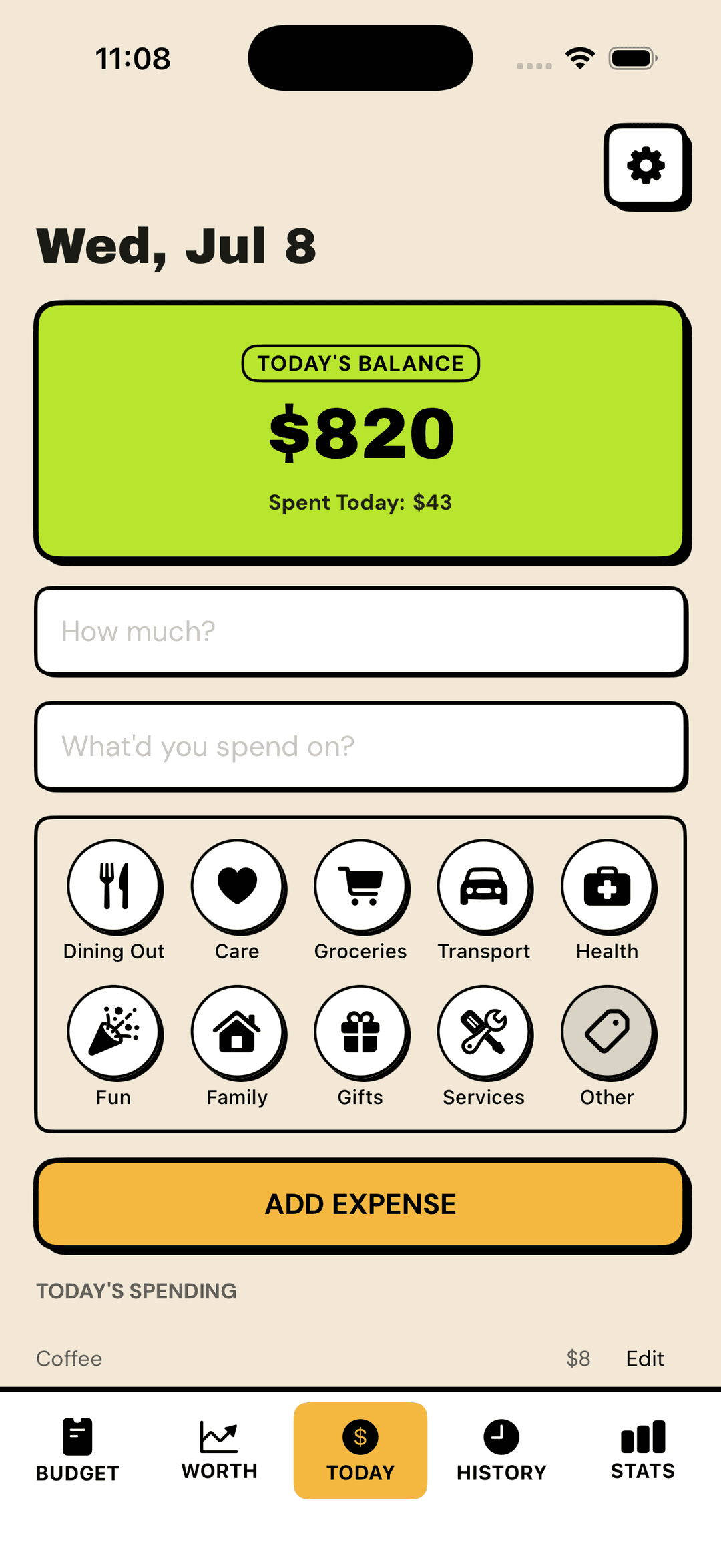
No modal. No extra screen. It all lives right here.
Designed to be opened
When I started building the iOS version, I did not want Depo to look like every other finance app.
A lot of financial products are designed to feel soft, calm, and overly polite. They use the same safe colors, the same gentle cards, and the same generic “we will fix your life” energy.
That is not Depo.
Depo is bold, loud, and direct. It has strong colors, thick black borders, and no soft fintech aesthetic. I wanted it to feel like a tool you actually want to open — not another app you avoid because it feels complicated, boring, or quietly judging you.
The number is not there to judge you. It is there to tell you the truth.
Sometimes that number will be red. That does not mean you failed. It means the plan needs attention. Maybe spending needs to pause for a while. Maybe an upcoming bill, a savings goal, or the month itself needs adjusting.
A negative number simply means that, after accounting for essentials and savings, more money is already committed than is available for the days left in the month.
Tomorrow adjusts, and you keep going.
You type it. You notice it.
Depo does not connect to your bank account. That is intentional.
I would not want to give another app access to my bank account, so I would never ask someone else to do it. But privacy is not the only reason.
When everything is automated, it is easy to stop noticing. Transactions appear after the fact. Money moves around. You can see it, but that does not always mean you are thinking about what you spent or why.
Transaction appears, unnoticed.
You type it, you notice it.
My routine with the spreadsheet was never complicated. I would buy groceries, get home, open the sheet, and enter the amount. Sometimes I did it immediately; sometimes later that night. It took less than a minute, but that minute changed the purchase from something that disappeared into a bank feed into something I had consciously chosen.
Depo keeps that moment of attention.
You enter what happened. Your number updates. You know where you stand.
One number today. The bigger picture when you want it.
Depo is built around one number because that is what helps in the moment. You open the app, see what is safe to spend today, add what happened, and move on.
But those small entries do not disappear.
Over time, they become a record of your money: what you spent, where it went, and how things changed from one month to the next. When you want to look back, Depo gives you a clear view without turning your everyday screen into a dashboard.
Statistics show the patterns that are easy to miss day to day. You can see your spending over time, which categories take up the most space, and how this month compares with the ones before it.
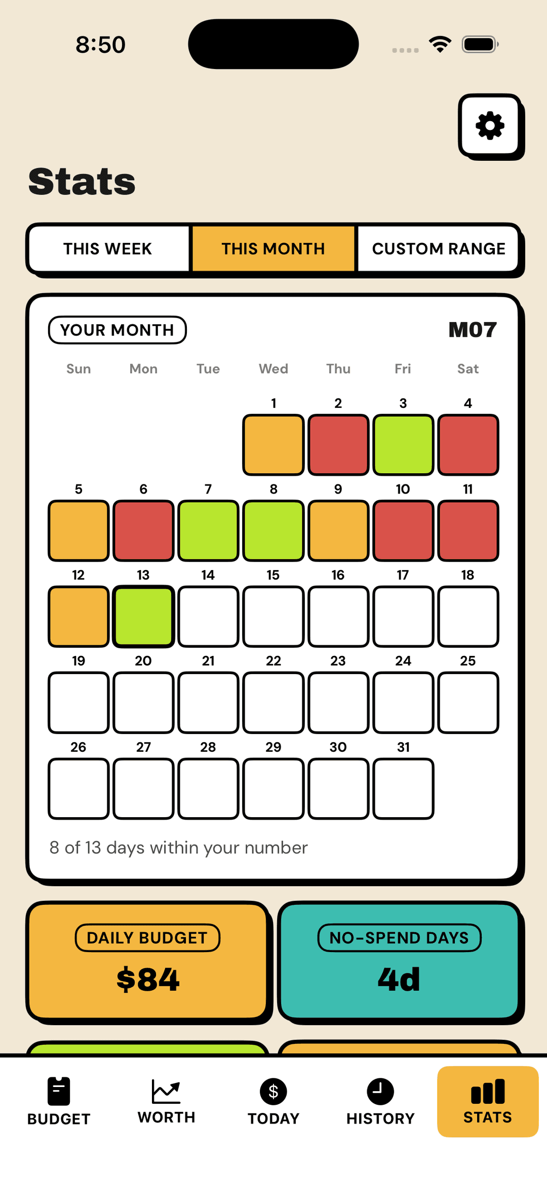
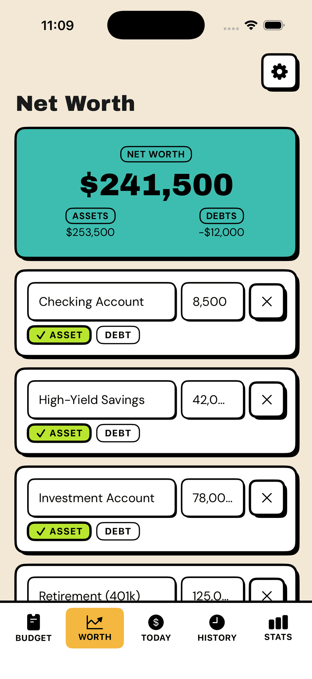
Net Worth gives you the wider number: what you own, what you owe, and where you stand overall. Accounts, assets, and debts come together in one honest total—then you can see how that number changes over time.
The daily number is still the point. The rest is there when you want a wider view.
Not more to manage. Just more of your own picture, whenever you want to see it.
Built for real life
Depo is for average people, freelancers, non-conformists, and anyone whose income or life does not fit neatly into a monthly spreadsheet.
For people who have tried budgeting before and quietly stopped. For people who hate complicated finance apps. For overthinkers, skeptics, and anyone still figuring it out.
It started as a spreadsheet that helped me see my own financial situation clearly. Then it became a small web app I built for myself. Now it is an iPhone app built around the same idea that worked for me all those years ago: an honest number that helps you understand what is possible today.
I built it for people who do not want personal finance to become a project.
It's time to see your number
Check Depo. Know where you stand.

No bank login. No account linking. Just you and the number.